When you’re working on a design, be it a logo, brochure or 10ft billboard, it can be tempting to go with colours that are most appealing to you. But colours carry specific meanings and the colours we favour personally may not send the right message to your target audience.
In the world of design, colour choices are used to associate brands with specific characteristics or emotions. These cues can be taken from nature, for example fresh green, dangerous red and sunny yellow, while some come from society, like regal purple or feminine pink, for instance.
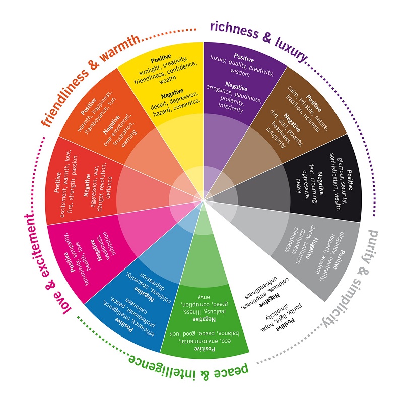
Over time, these associations have solidified into what’s become known as the psychology of colour. Each colour has some commonly-defining traits, as summarised in the chart below:
We’re programmed to respond to these cues – both positive and negative – and subconsciously interpret colour as we go about our daily lives. Much like our ancestors would have avoided poisonous red mushrooms or yellow stinging wasps, we too have an innate response to colour.
In fact, we’re so used to interpreting colour that it’s thought to have become a part of our decision-making process. A study called the Impact of Colour in Marketing, found that up to 90% of snap judgments made about products can be linked back to colour.
Advertisers and designers are only too aware of these associations and regularly tap into the power of colour choice in their work. To illustrate what we mean, here are a few company logos as examples:
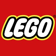
RED
Primary red is one of the core Lego brick colours, but it also sends a message about their company culture. Red tells us that Lego are bold, creative and extremely passionate about what they do. They are not afraid to push the boundaries in order to design new and exciting products for their customers.
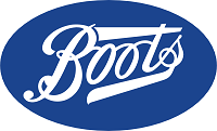
BLUE
Efficiency, intelligence and calmness are values Boots would want their customers to associate with their services. Equally, blue is also thought to be an official, authoritative tone, which lends itself perfectly to Boots as a pharmacy (the NHS logo is also blue).
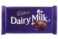
PURPLE
Conveying luxury, quality and creativity, Cadbury’s signature purple has been used so extensively that many of us would now recognise just the colour alone as their branding. This colour helps to make their product seem more enticing and desirable.

GREEN
Green is a good example of how colour can be used to align your brand with certain values, whether they are reflected in reality or not. Traditionally associated with nature, environmental harmony and positivity, green is a very deliberate choice by BP here.
![]()
YELLOW
As a charity, yellow works perfectly for Dogs Trust. Positivity and friendliness are at the heart of the work they do and the optimism of the colour choice shines through across all their marketing materials.
Once you start looking, it’s easy to spot these colour choices everywhere and, in turn, the subtle messages that brands are trying to convey with them. But, in reality, can a colour really influence the way we see a brand?
Well, it would be naïve to assume that people blindly accept a company as ‘eco-friendly,’ ‘strong’ or ‘reliable’ simply because of their brand colours – people are cleverer than that! As consumers, we are more likely to judge companies on our experiences or what we hear about them from friends, family or the news.
That said, colour choice is certainly not something to be overlooked. As the research suggests, we make snap assessments on products all of the time and brand colours are one of the things people pick up on. Whether knowingly or not, colour can subtly influence how something is perceived, so it’s important to spend a bit of time thinking about it.
Making sure the colours in your design a) look good and b) send the right message, will help to make your finished artwork much easier to process and far more effective. The colours you choose won’t tell a customer everything they need to know about your company, but they’re a great place to start!
Want some design advice for your next printed project? Our in-house team of creatives will help you create a design that sends the right message. Get in touch with them today.
Want to hear more from the specialists here at Digital Plus? Sign up to our newsletter for regular updates from the team.